← back varënna | updates Jan 21, 2026Design Notes on the Varenna Demo
I have been building a small design system called Varenna that lives in three places: CSS, a ratatui TUI, and an iced GUI. The demo exists to answer a simple question: can one visual grammar survive across these very different surfaces without feeling like a forced port? The answer is "mostly yes," and the demo is where I pressure test that.
This post is a casual walkthrough of the demo and the design decisions behind it. It is not a release announcement. It is just a tour of the parts that matter to me as I iterate.
What the demo shows
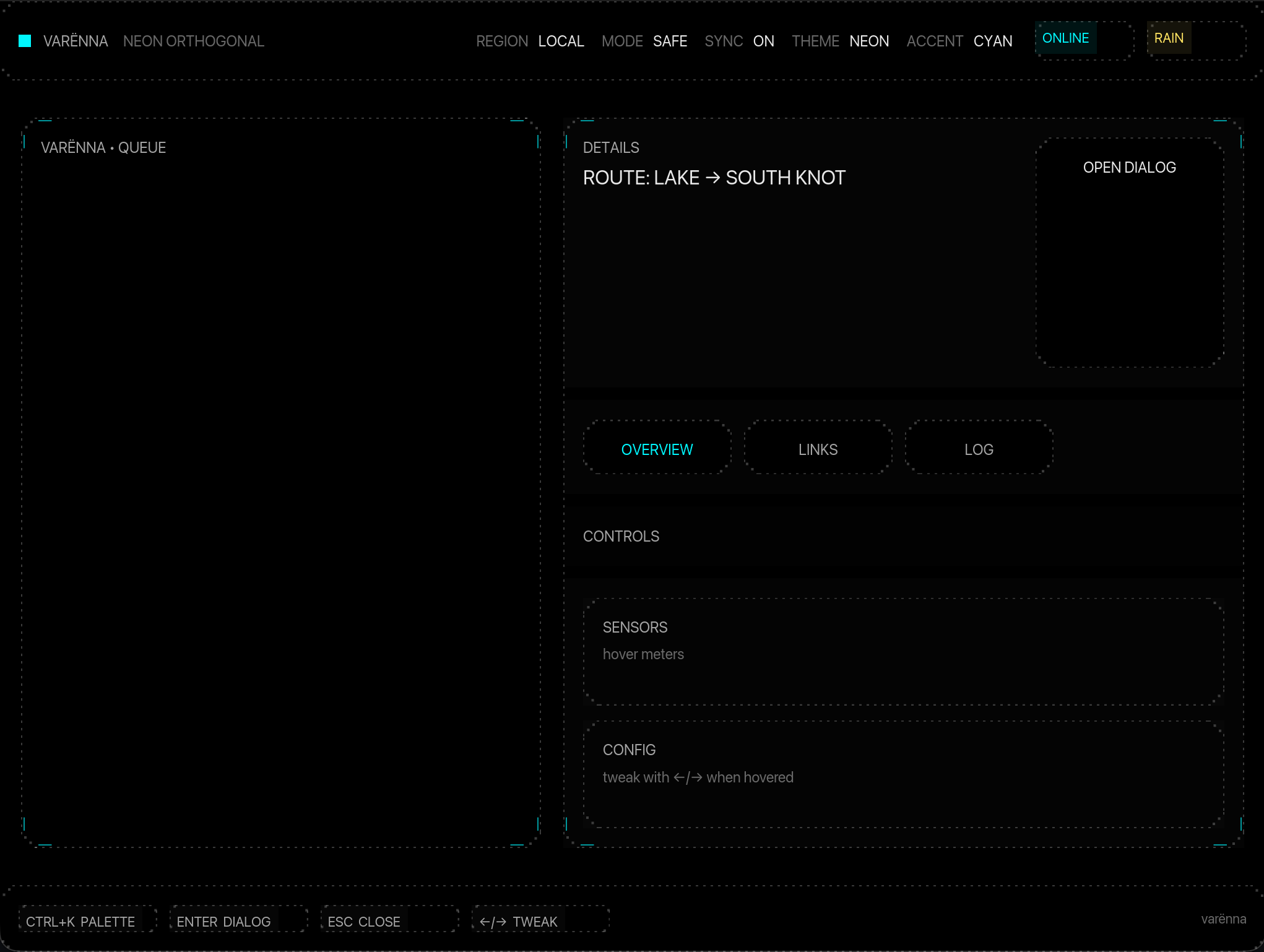
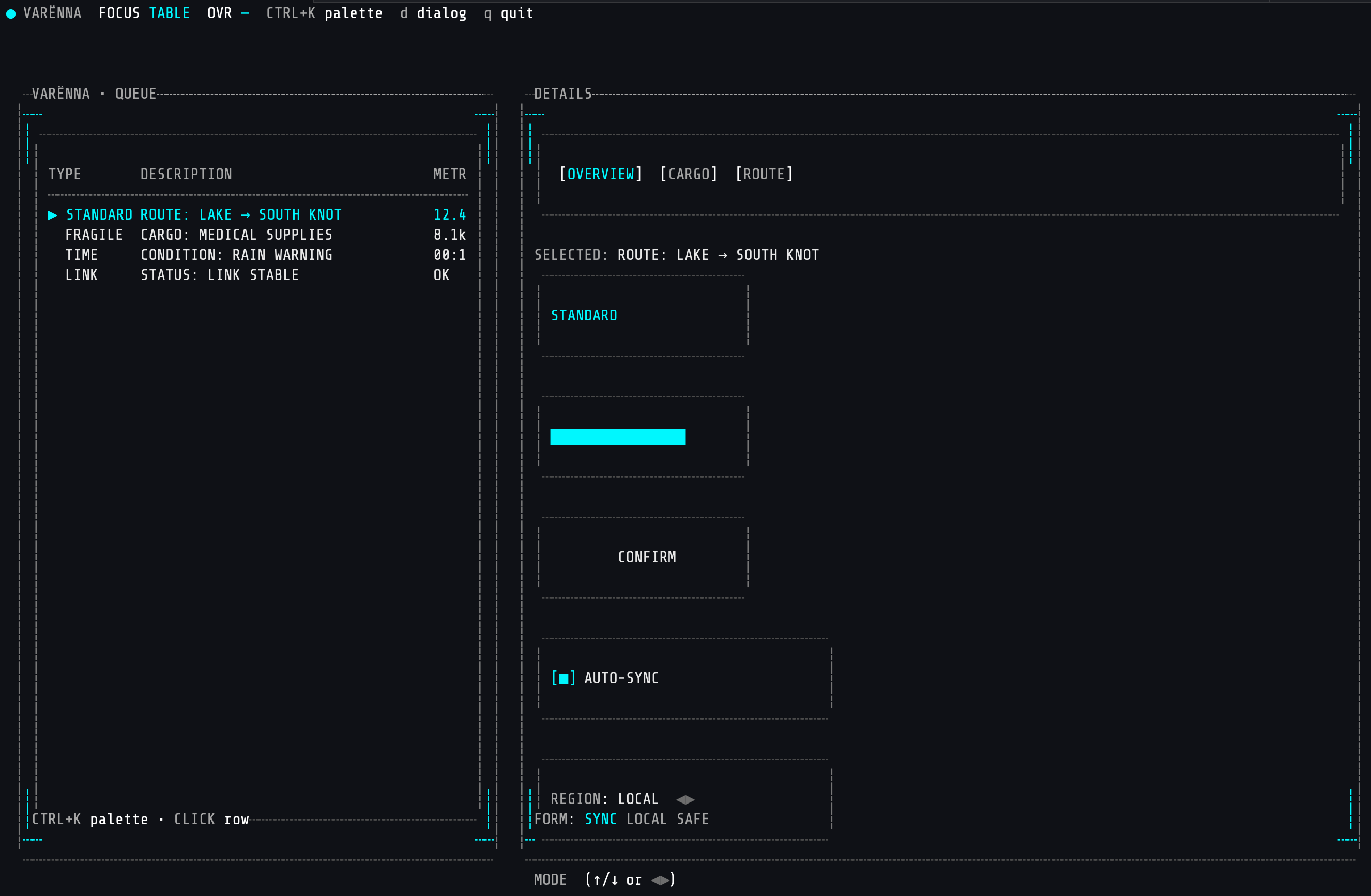
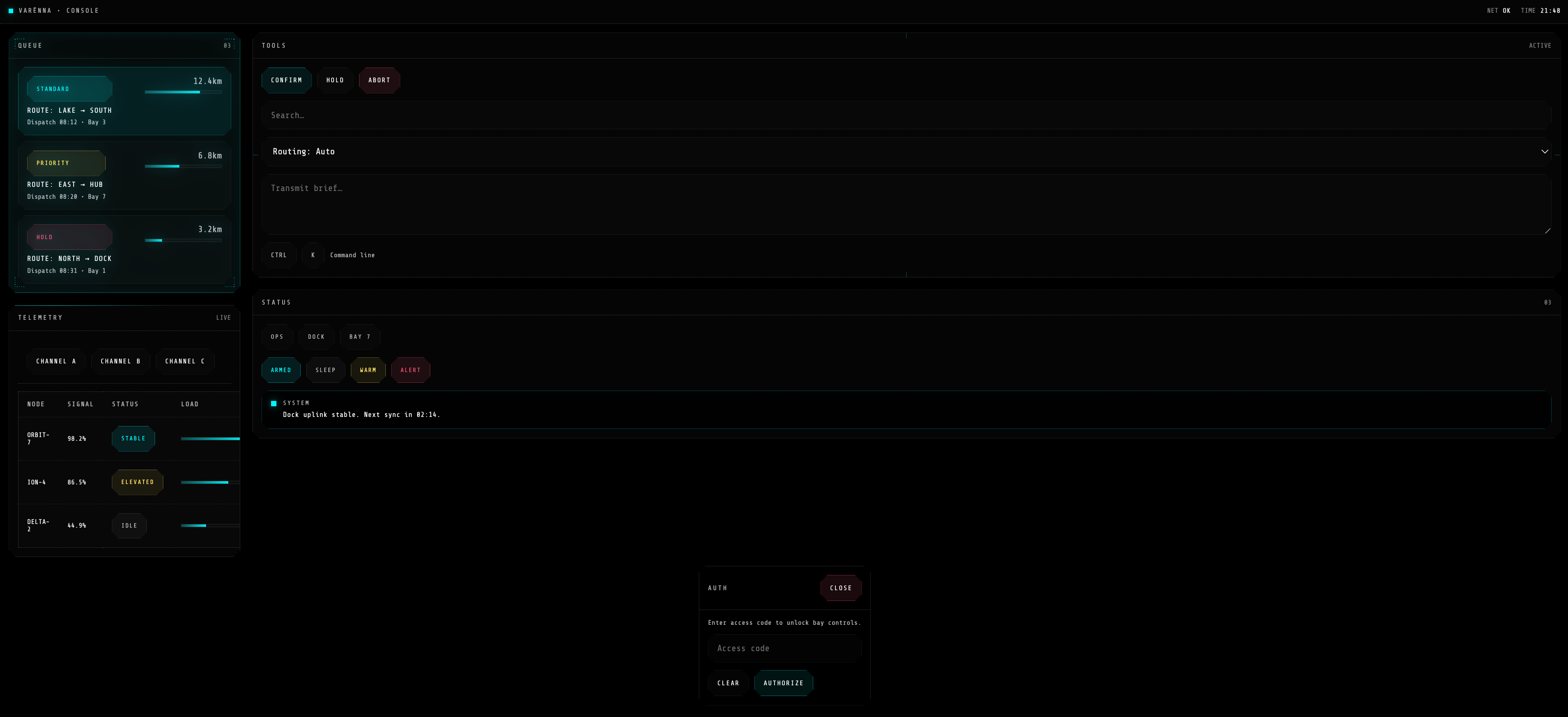
The ratatui demo is a split layout: a left panel with a queue table and a right panel with details. It is intentionally dense so I can test readable spacing, hover states, and keyboard focus at the same time. There are also overlays for a command palette and a dialog, plus a toast stack so I can validate transient messaging.
The CSS demo mirrors the same components: panels, badges, tabs, meters, buttons, inputs, and a dialog. I keep the HTML minimal because the point is the component styling, not the DOM structure.
Visual grammar: tokens first
The design system is token driven. I treat spacing, line weight, and accent color as the "voice" of the UI. The tokens are not just for colors. They also encode details like:
- padding size (used for both layout and inner frame calculations)
- border weight and dotted line style
- accent glow intensity (used on hover)
Keeping these in a single place makes it possible to tune the overall feel without hunting through component code. When I push the accent brightness up, everything that wants to feel "active" follows.
Panels and frames
The core component is the framed panel. The frame is always the same language: clipped corners, dotted borders, optional ticks, and a bold title. The frame is drawn first, then the inner content is rendered into a padded inner rect. This matters in a TUI because any off by one errors will panic or leave artifacts.
The frame does two jobs:
- It isolates content so dense layouts are still readable.
- It communicates the "device" vibe without needing background art.
I also use the frame in small components like badges and meters. That keeps the system consistent, even when the component itself is only 5 lines tall.
The ratatui demo: interaction and state
The demo is designed around 4 focus areas: table, tabs, button, and form. Mouse hover is supported, but the keyboard is the default. The focus indicator in the top bar is the fastest way to spot state bugs when I am debugging.
Important interactions:
- Arrow keys move within the table and form.
- Tab switching is both mouse and keyboard friendly.
- Ctrl+K opens a command palette and dims the background.
- D opens a confirmation dialog.
- Q quits.
The overlays matter because they are a state stack, not just a widget. They force me to manage focus, block input to the base UI, and handle clicks outside the modal. The dimming layer is a tiny detail, but it makes the demo feel like a system instead of a bunch of rectangles.
The design payoff
The thing I like most is the way the system feels "electrical" without being noisy. The glow is restrained, the frame does the heavy lifting, and the typography stays small and tight. The goal is that you can look at a screen full of this UI and still scan for the important stuff quickly.
The demo also keeps me honest about density. A terminal window does not have infinite space, so the layout has to work at smaller sizes. If a component cannot collapse gracefully, it does not belong in the system.